ARCH 1202 - Arch Studio 4
Wednesday, 18 September 2013
Further development
After discussion with my tutor, and suggestions of projects to look at, I became very interested and inspired by the forms of OAB, in particular the Barcelona Botanical Gardens and the Fitness Center, headed by Carlos Ferrater. His approach to the integration of landscape and architecture is so beautiful and seamless, entwining pathways, whilst holding back and manipulating the landscape with the blade walls that hold back the fall of the site. In the Barcelona Botanical Gardens, the natural contours are still retained, whilst small moments are revealed where the ground is peeled back and flat landings ensnare walkers by to stand and pause to appreciate the design.
I then experimented with the effects of three different forms on the Coal Loader Platform; a Transitional piece, a Landscape piece and a Pavilion piece. Their framing of the site and the circulation provided when the walls are simplified provides a diagrammatic analysis, from which I can further my experiments of the site.
Investigation - Experimental Process
From my initial concepts of blade walls, and the ideas of landscaping, I felt that there was something missing from the Coal Loader site. By the industrial installation of the Coal Loader platform, flattening the ground and composing a rigid sandstone box, it felt like it had been stripped of nature. By that I mean that the natural landscape had been violated, defected and there was a heavy void which should otherwise be falling to the sea.
I wanted to bring back the slope, the pre-existing environment that was there before the industrial development almost 100 years ago. This was more than just an aesthetic decision, resting on the morals of what is right as an architect to interpret the site, the client and to provide the existing surroundings with a contextual link to either its history or its future.
Graphically, I started by re-placing the contour lines on the Coal Loader that it had stripped the site of. It was not a hard task; by analysing the contours of the site plan, it was clear to see the gradient and relief.
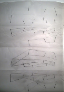
After that, I identified points of interest, where the contours bunched up, or changed direction in succession, and ultimately, moments where the landscape would be special disregarding the Platform. These moments of interest are represented as lines, in the direction of their grade, and the length is representative of the extent of the moment.
With these points of interest, I could then begin creating geometric forms, drawing links between the lines.
Next was the conception of these geometric shapes as spaces, both negative and positive. Following, I created a diagram of the tectonic shift of these spaces, causing vaults up and down, so that they were always rising and dipping along the fault lines.
With the initial process drawn up, I began conception of a 3D model to understand it further. I created the fault line along the common points of the geometric shapes, to develop something I could play with.
It then became a more flexible model, in paper so that I could manipulate and play with the rises and falls that were created by the split in the 'landscape'.
The final part of the process was to redraw, with the interpretations made of the 3D model. I wanted to conceive spaces where a walkway weaved in between the extruded forms.
After I reached the end of the process, I came to the conclusion that it provided me with the right direction; that of a form derived from the landscape, reflects it, but also creates an interesting effect of contrast; seclusion into the voids and spaces created by the protrusions, and also the openness that was provided by the walkways opportunity to breathe the wide open spaces. I did, however, find it a primitive and restrictive iteration. So, using the same points of interest, which I will now refer to as 'blades', I began experimenting with the countless combinations of geometric links that were possible, as I knew with this trial and error, I could find an origin with which I could develop a much stronger scheme, with more opportunity to rise and fall in relation to the site, whilst providing harbours and much more complex space.
Different iterations of geometric form, starting with simple, disassociated shapes, and moving to more intertwined, complex geometries.
It was through this process that I was able to analyse the options for the opportunity they provided. I wanted some level of overlapping as this would reflect the cascading effect of the landscape falling away. More separate forms meant more level changes, whilst too many tended to develop singular spaces which had no connection. It was better that they were more extreme in their angles, as this would eventually form the peeling back of the ground to create spaces that are more dramatic and provide a sense of shelter and retainment from the fall of the site.
I then decided to do the same process for the upper site, as I felt it would be much more sensible and logical to create a unified theme throughout the project, rather than two separate themes that divide the site and cause a disparity.
Concept Sketches.
Ideas of spaces resting in the landscape. I wanted to see how a form could sit either in the landscape, or be situated on top, as a floating box levitated on the blade wall.
opportunities for the landscape to peel back and integrate with structures.
The different opportunities present with the landscaping ideas.
Terracing of structures on the hillside of the upper site.
Concept 1 : Blades
I extrapolated on the blade wall idea as I found it provided the most complex form to play around with and experiment.
Created a model which showcased the possibilities of space, whether a walkspace above, below or the tunnels throughout.
Sketches of spaces and interesting opportunities to utilise the versatility of the blade walls as moments of space and exclusion, as well as its interaction with light and space perception.
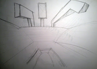
A draft idea of the amphitheater, a void cut into the coal laoder and the blade walls cantilevering over the top to create the illusion of an enclosure, whilst still allowing light and open air.
Sunday, 15 September 2013
Coal Loader Preliminary Concepts
Initial Ideas
I found this section by MASS Studies architects to be quite interesting. I wanted to create a design which integrated the voids of below with the spaces of above, to develop a complex section much like above. These spaces coexist, yet some of them are never aware of the others, while in other occasions, the spaces can only truly be explored in context of one another. I wanted this play of space and use of below ground in my designs, as my preliminary sketches show.
The tunnel begins as per usual, with four entrances...
Then small voids open up and become interconnected with other tunnels...
The ground plane is varied, and provides opportunity for people to not only look up, but to look down into the tunnels...
And finally, a section that is relatively divorced from the initial section, where the spaces have merged, and different moments can be experienced from different locations within the same overall space.
These sections explore the possibility of varying the tunnels course through its length, allowing it to deliver people at different points in a contoured landscape. Some spaces connect, while others have exclusive access to spaces that cantilever over and above others. The tunnel begins to provide more than just a path, but an opportunity to explore which was otherwise a fairly bland experience. Giving all due historical merit, not all four tunnels are required to show what one could. I also was interested in opening up the east wall (where the chambers were) to the sea, and allowing underground moments where the water was not only visible, but accessible.
Secondary Concepts
I first wanted to understand the scale and concept of the Experimental Art Foundation that would be situated in the side of the existing Coal Loader. I jotted down my perception of what Experimental Art is, and the direction I would head in. I decided that my Experimental Arts would showcase the dependence on the senses.
I gave designation to the access of the Coal Loader, and decided that there should be more than the 2 existing access points, by integrating a third on the south side of the loader, both for entry and exit value. This creates a much more open circulation, where no one progression through the site is defined, giving the occupants much more ownership of their experience.
I then moved onto overall concepts of form, creating many options from which I could compare and contrast their benefits and highlight their potential.
Concept 1 : Blades
I didn't realise until after research, but this was actually only a model made by RCR Architects on one of their projects. Although I assume the blades are just a representation of the landscape, I found it quite powerful how their was an interpreted dialogue, that the mind perceives two conflicting views; one of that of the blades structurally supporting the buildings above, and that of the landscape that one can interact with, walk on and through. So I drove that concept, exporing the options possible with these blade walls (not to confuse with Mies van der Rohe) becoming more than partitions, but moments to capture the circulation, draw the audience within and vary their path with intangible salient points.
I wanted to give back the form of the landscape that was lost through the condemning of the Coal Loader, which was possible with these blade walls. These single walls, with continuity, would make a larger perspective that could be assumed as reliefs in a landscape.
Such possibilities with this design are numbered; not only can you walk through, ontop and below, there is the implied voids though repeating blade walls that have deliberate perforations.
Concept 2 : Box Tunnel
I wanted a modern reinvention of the Coal Loader tunnels, by rationalising geometric form as modern architecture does. A less traditional approach, to remove the concept of curves and arches from the existing tunnels and assess the space in between, which was analysed as almost perfect squares. These new forms running congruent to the existing tunnels would undulate and play with each other, providing moments of interaction at certain altitudes for crossing in circulation. Not always entirely enclosed, they would sometimes open with glazing or entirely roofless, open to the air.
Concept 3 : Voids
The concrete walls set into the natural landscape in the headland was powerful, and the idea of only seeing your assumed path from above is beautiful. When inside, a labyrinth feel is forced upon you, with brief spaces of natural light flooding in, before you are delved ever deeper into the program.
Subscribe to:
Comments (Atom)


.JPG)


.jpg)


